Choose a module layout
To build your own module, start by choosing a layout. This guide lists all layouts and their configuration options. Go to our demo site to see the modules in action.
|
|
Contents
How to choose a module layout
Rotators
Grids
Lists
How to choose a module layout
Modules are grouped into three categories: Rotators, grids, and lists.
Rotators scroll horizontally to show many items in a single row. They’re best for fitting a lot of content into a small vertical space. Grids show items in a grid pattern. They’re best for making sure items are always visible on the page. Lists display a large collection of content.
Follow these suggestions to select a specific module based on your content:
To highlight featured content…
Featured rotators show any content in a large banner.
Billboard rotators show advertisements or other content in a skinny banner.
To list sessions…
Square rotators and Two-column grids show any specified sessions.
List pages add a search bar and filter to a large collection (20+) of sessions.
To list exhibitors, courses, or on-demand content…
Square rotators, Two-column grids, and Multi-column grids show any specified content.
List pages add a search bar and filter to a large collection (20+) of content.
Courses work differently than the other content types. Please see Course functionality constraints.
To list speakers…
Round rotators and Round grids show any specified speakers.
Round list pages add a search bar and filter to a large collection (20+) of speakers.
Rotators
Featured rotator
The featured rotator is a large banner used for featured content. It showcases one item at a time as it rotates. You can turn this module into a static banner image by only including one item total.
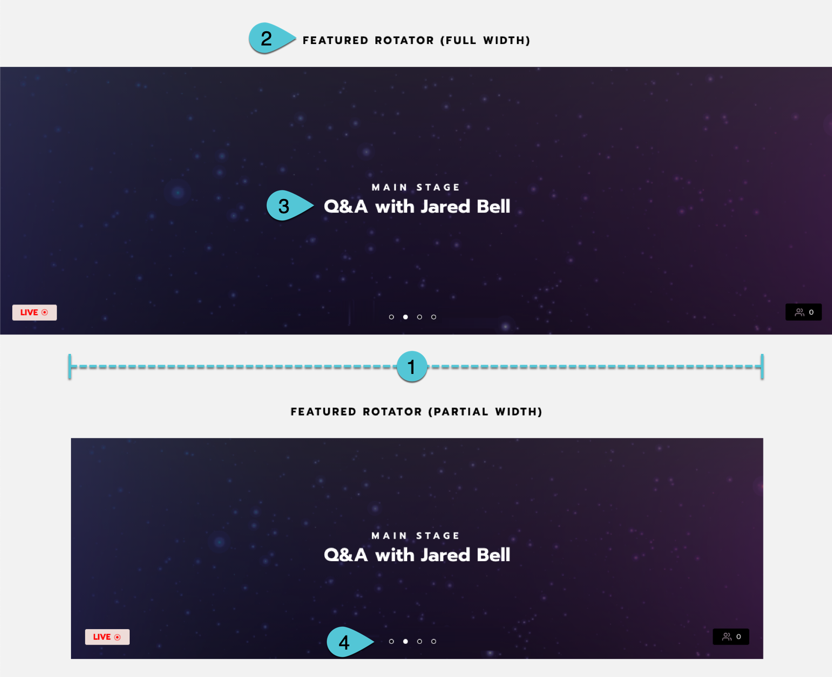
An example featured rotator. See the configuration options above.
Billboard rotator
The billboard rotator is wide and skinny. It’s typically used for advertisements. It showcases one item at a time as it rotates. You can turn this module into a static banner image by only including one item total.
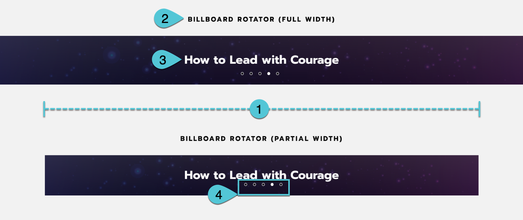
An example billboard rotator. See the configuration options above.
Square rotator
The square rotator showcases multiple items at once as it rotates. You can choose to show 3 or show 4.
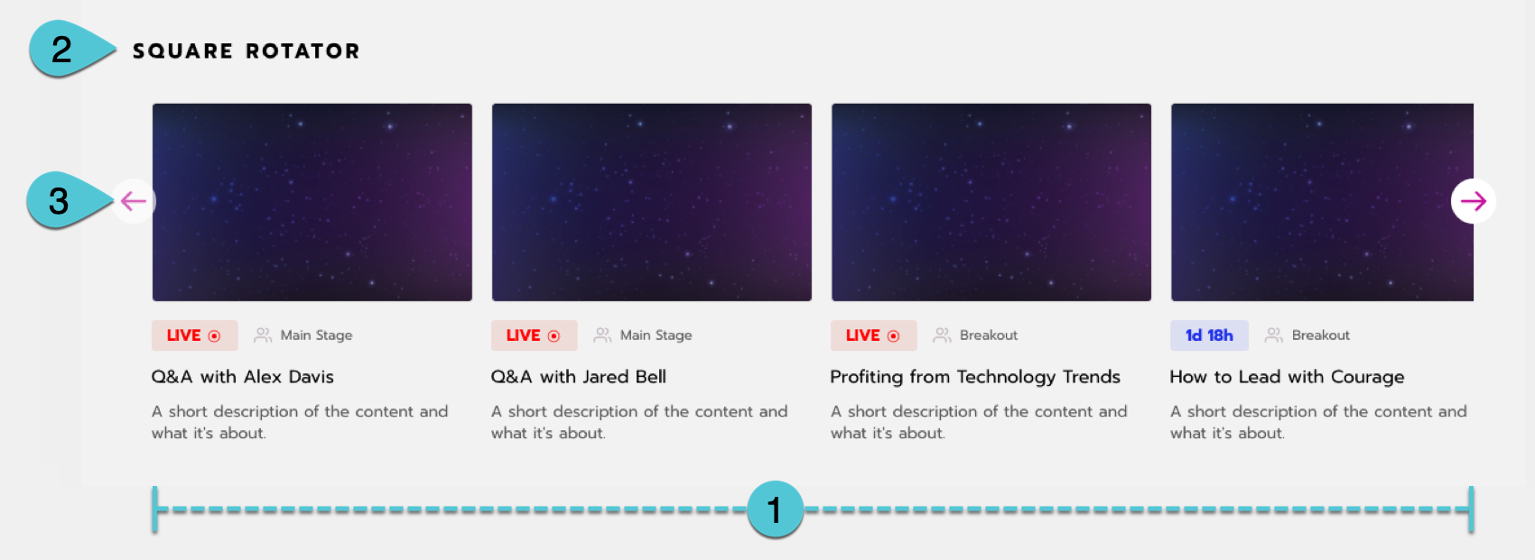
An example square rotator. See the configuration options above.
Round rotator
We recommend only using this module to showcase speakers. It showcases multiple speakers at once as it rotates. You can choose to show 3 or show 4.

An example round rotator. See the configuration options above.
Grids
Two-column grid
Also known as Square Grid.
This grid is always two columns wide.
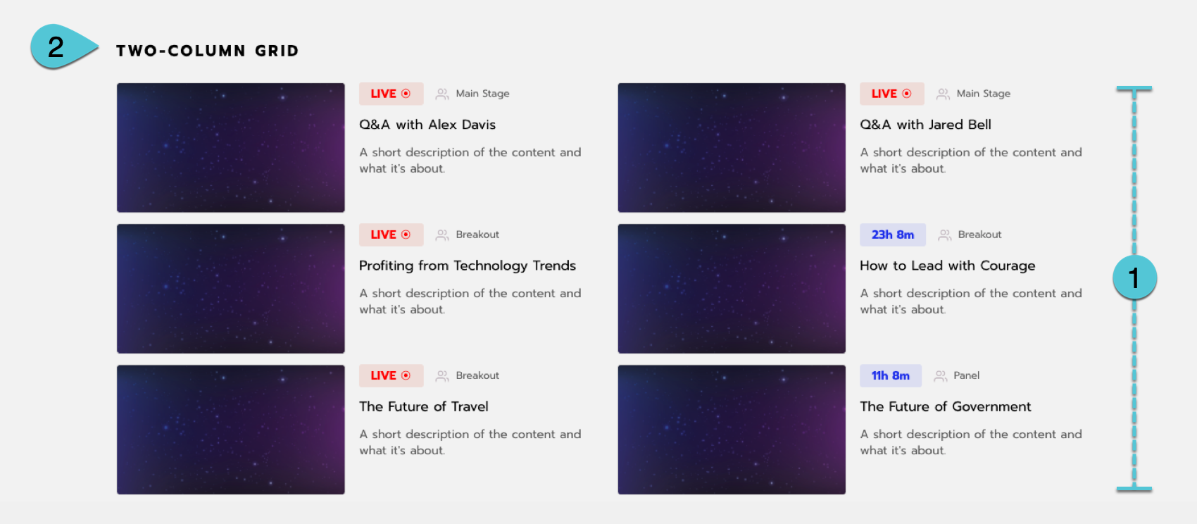
An example two-column grid. See the configuration options above.
Multi-column grid
Also known as Grid Image.
This grid can have 2-5 columns.
It’s often used for displaying exhibitors in multiple levels. For example, higher-level exhibitors appear larger in a grid with two columns, while lower-level exhibitors appear smaller in a grid with 3 columns. We don’t recommend using this module for sessions because it doesn’t include the session status (like Live or Past) or type (like Main stage or Panel).
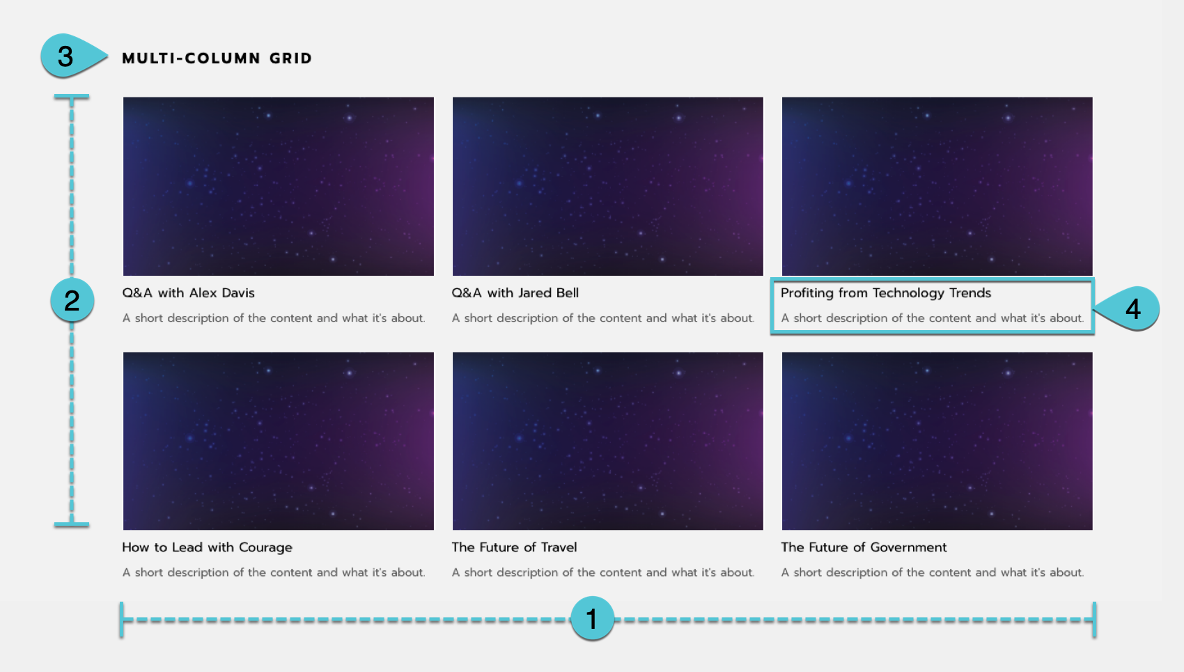
An example multi-column grid. See the configuration options above.
Round grid
We recommend only using this module to showcase speakers. This grid can have 2-6 columns.
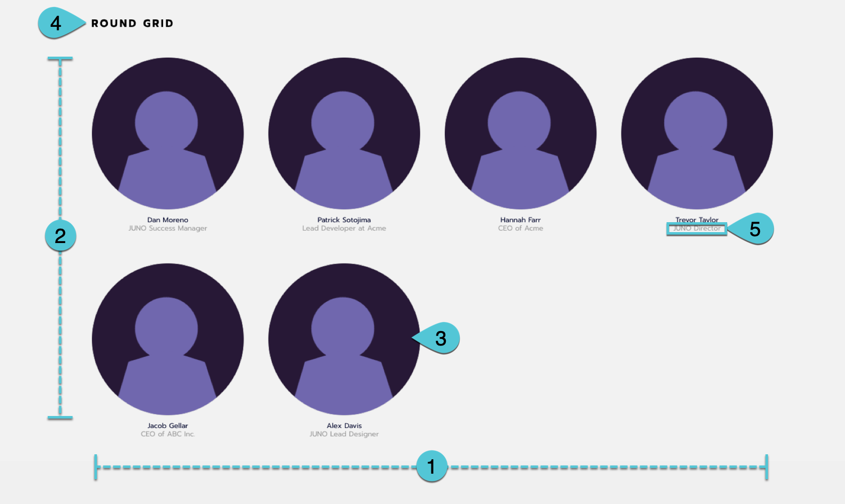
An example round grid. See the configuration options above.
Lists
List page
A list is a special page type that displays an infinite number of items at the bottom of the page. It can have 2-5 columns. Above it, you can include a search bar and filter options. Any other rotators or grids can be added above the list and search bar, but none can be added below it. Only the list is searchable.
If you have 20+ items to display in a grid, a list is the best choice. It helps pages load faster because items load as you scroll, instead of all at once.
We recommend using a list to display all of a specific content type. For example, on your Sessions page, you could make all sessions searchable.
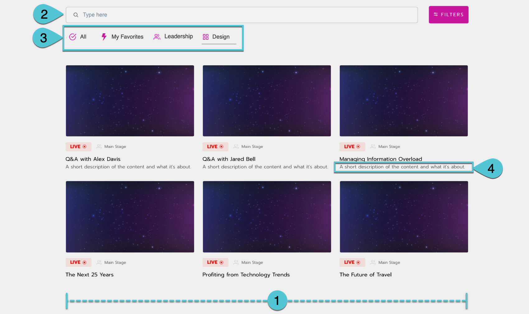
An example list page. See the configuration options above.
Round list page
We recommend only using the round list to showcase speakers. It displays an infinite number of items at the bottom of the page. It can have 2-5 columns. Above it, you can include a search bar and filter options. Any other rotators or grids can be added above the list and search bar, but none can be added below it. Only the list is searchable.
If you have 20+ items to display in a grid, a list is the best choice. It helps pages load faster because items load as you scroll, instead of all at once.
We recommend using a list to display all of a specific content type. For example, on your Sessions page, you could make all sessions searchable.
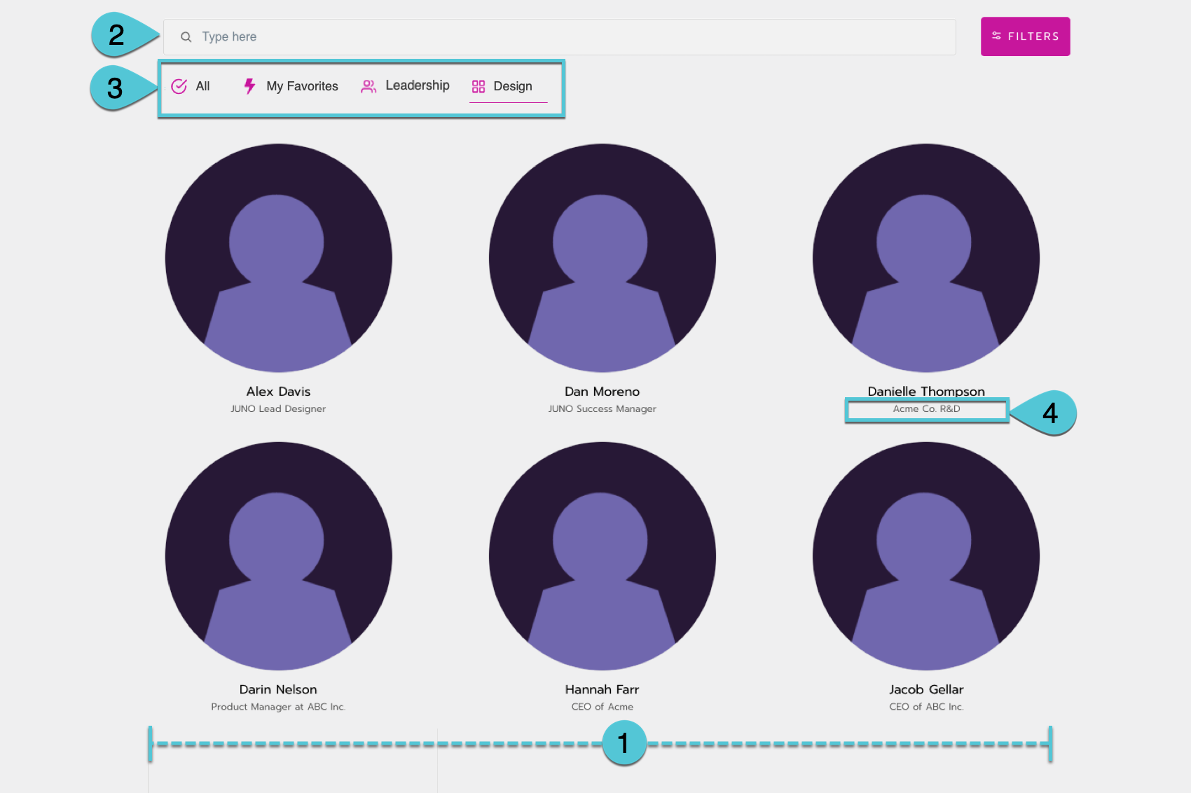
An example round list page. See the configuration options above.
